
n11 is preparing for November with a new vision.
n11 has entered the month of November, known as one of the busiest sales periods in the e-commerce sector, with a renewed brand identity. This change, made to emphasize user experience, particularly stands out in terms of visual elements.
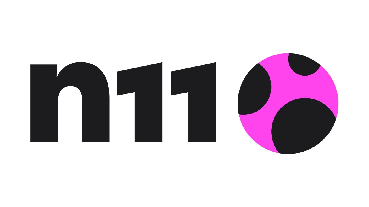
In the new logo of the brand, the ladybug, which is the symbol of the platform, has now taken on a more modern form represented by an abstract circle seen from above. This design change aims to strengthen n11's bond with its users while also symbolizing the brand's dynamic structure.
The new brand colors consist of magenta and black tones, created to evoke a vibrant and emotional perception commonly associated with shopping. This choice reinforces n11's vision of “The color of business is changing” and aims to offer users a colorful experience.
n11 CEO Nihal Dindar Akın stated that this transformation is not limited to the external appearance and that many surprises are being prepared to innovate the shopping experience for users. Akın expressed, “The transformation announced with our November campaigns will continue with many surprises to astonish our users. This new era, which starts with Colorful November, is the beginning of a user-centered vision.”
N11’s innovative approach stands out as an indication of the brand’s continuous desire for development and change. The platform continues to improve its strategies to meet changing user expectations and gain a competitive advantage. In this respect, the innovations that n11's renewal process will create, both visually and operationally, will help establish a stronger interaction with its users.
Sizin İçin Derlendi


.png)
Yakında Tüm Platformlarda
Sizlere kesintisiz haber ve analizi en hızlı şekilde ulaştırmak için. Yakında tüm platformlarda...
.png)